Studio Ghibli Website Redesign
Objectives:
Design a responsive informational/promotional website that covers core functionality
Scope:
Interactive Responsive Website
Contributors:
Zachary Smith
Duration:
6 weeks
Studio Ghibli Background
Studio Ghibli was founded in 1985 by Hayao Miyazaki and Isao Takahata. Their films explore themes such as war, man vs. nature, and identity and do so in an honest way. Miyazaki captures the raw human emotion through his attention-to-detail style of animation, making it second nature to empathize with each character.
Recently, there’s been a resurgence in Studio Ghibli popularity due to their movies becoming available on HBOMAX, a new streaming service. Studio Ghibli’s current website is outdated and lacks the magical experience their movies create for viewers.
Studio Ghibli wants to change this. They want fans and newcomers to be captivated by the content offered on the website through beautiful visuals for each movie, a library of Studio Ghibli assets fans can download, and a CTAs that lead users to platforms where they may stream their movies and soundtracks or purchase digital copies.
Introduction
Addressing the problem
The official Studio Ghibli website fails to encapsulate the essence of their films nor does it simplify the process for users to discover how and where to watch their movies.
Solving the problem for fans
Fans of Studio Ghibli deserve to have an official website that streamlines legitimate content resources in a visually appealing way that’s exciting and feels as alive as the animated films.
Why it’s necessary
By enhancing the official Studio Ghibli website with redesigned UI, playful interactions, and updated IA that directs users to streaming services, users will be more likely to engage with the official website.
Research: Goals and Methodologies
The purpose of redesigning Studio Ghibli's official webstite was to redesign the UI and interactions in a way where the site resonates with users in a similar manner as their movies, while maintaining the current brand image. Since the official website currently acts more as a promotional inforamtion hub than a marketplace for their products, it was important to focus on the sense of immersive realism that their movies consistently embody and bringing the website to life. In order to do this my research consisted of two primary phases; Moodboarding and Asset management.
Goals
- Research the official website's
current popularity among the other
fan made Studio Ghibli websites.
- Identify UI trends that are applicable to promotional content and design.
Methodologies
Bookmarks and Mood Board
Asset Management
I searched for inspiration from landing pages, animation assets, movie posters, fan forum communities, video essays, store finder features, Hayao Miyazaki artistic process, documentaries, etc. and consolidated those resources in a bookmark folder on Google Chrome. Click the button below to view the mood board I used to save inspiration found on Pinterest.
I gathered a broad collection of assets gathered from a variety of resources that I planned on utilizing during design phase. Assets such as movie covers, character pngs, ambient landscape screenshots from Studio Ghibli movies, Studio Ghibli font, etc..
Defining the Approach
I decided to work on this project website in Framer, a design program that was new to me at the time of beginning this capstone. Due to the time constraints of this capstone, it's important to include the passive details (such as learning Framer) that contributed toward completing this website. So while gathering assets and searching for inspiration, I was also learning how to utilize Framer to its full potential.
Framer enabled me to take an iterative approach by building a functional mockup from the start. In other words, since interactions, animations, and transitions were included throughout the whole workflow, prototyping was seamlessly integrated from the beginning of the entire design process.
Interaction Design and UI Design Together: Wireframes to Rapid Prototypes
Through the capabilities of Framer, it was possible to combine deliverables from both the Interaction design phase with the UI design phase.
It's important to note that I wanted to maintain Studio Ghibli's brand image while redesigning their website. In order to achieve that I used the original color palette, but avoided using any flat colors throughout the site and utilized colorful gradients and images. I prioritized visual appeal along with minimal text in order to immerse users in the beautiful worlds of Studio Ghibli. To do this, I experiemented with glassmorphism cards and other semi-transparent elements.
Wireframes
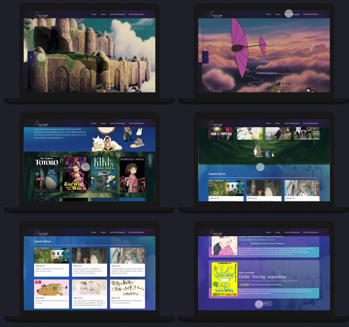
I began with sketching low fidelity wireframes for both the screens and the interaction concepts since functional prototypes were immediately possible in Framer. Below are wireframes of some of the main screens and the interactions within each page.
Desktop landing page
Movie selection interactions
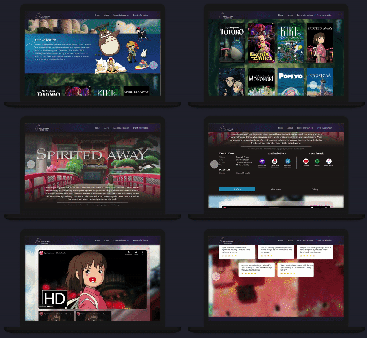
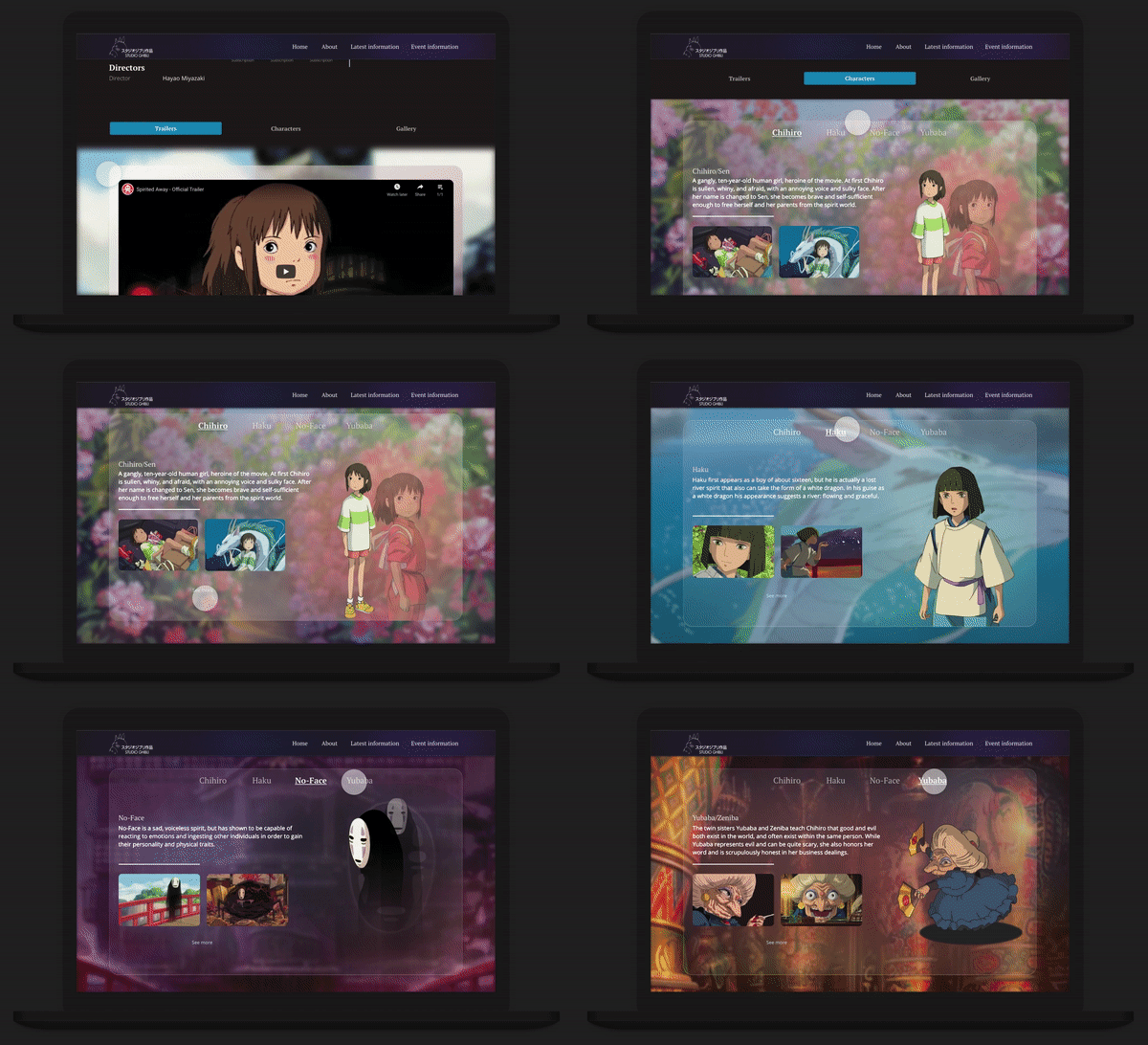
Desktop movie page
Movie Page interactions
Responsive Wireframes
Upon further iteration and gathering valuable feedback of the wireframe sketches, I moved forward with designing high fidelity responsive pages as well as building the responsive components I planned on making
interactions states for.
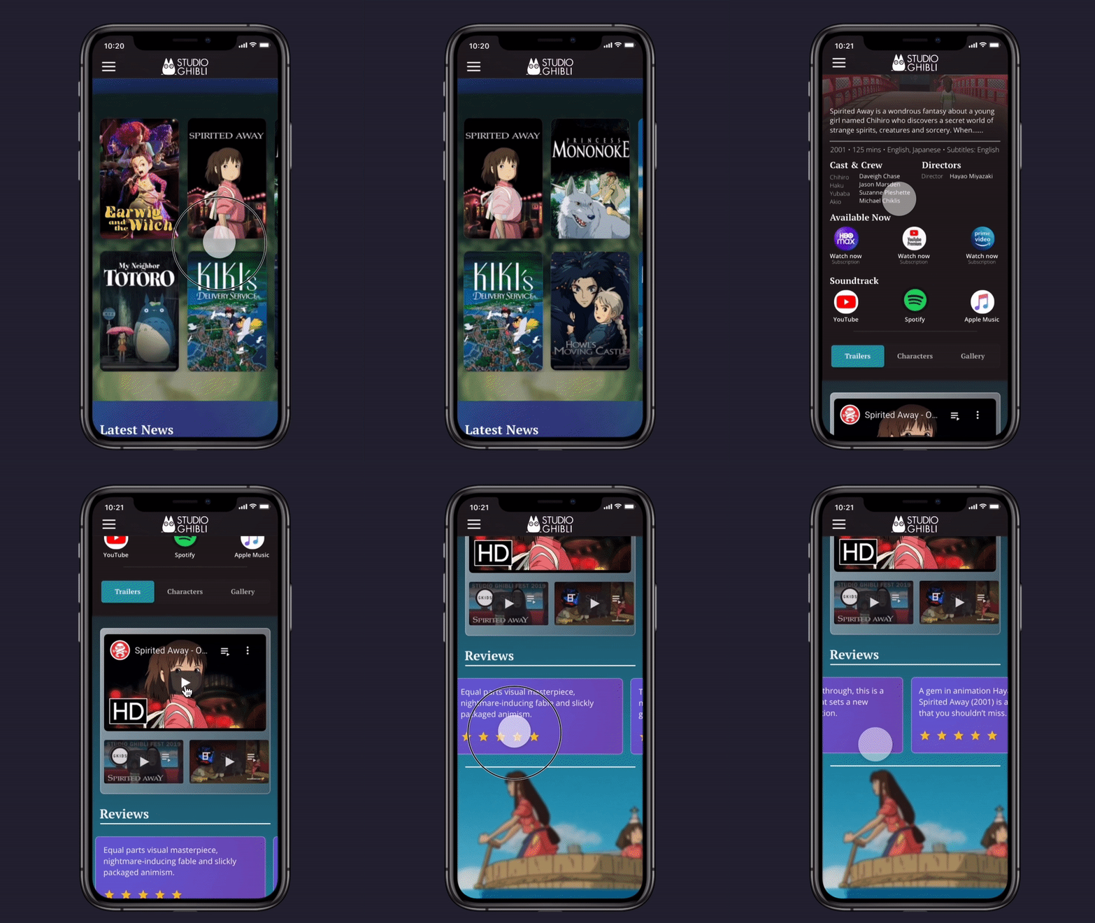
Designing the screens in Framer was a slow, iterative process because I was constantly testing the functionnality of new sections, component states, and interactions. I felt it was absolutely essential to get the small details right, as Studio Ghibli films never fail to do. Below are a few examples:
A hover state is indicated by a playful animation of the photo contained in each news card.
Similar to latest news info cards, the event posters expand when hovering over the glass event cards. The tablet and mobile version were scaled down and the hover states removed.
Rapid Prototype
The official Studio Ghibli website isn't an ecommerce site and functions more so as an information hub to promote their movies and events. Therefore, the rapid prototype I built was focused on desigining the necessary screens for a user to learn more about their favorite movie along with CTAs that would redirect them to a streaming service to watch a Studio Ghibli movie or listen to a movie soundtrack.
Although many interactive components ultimately didn't lead users to to a destination, it was important to bring each screen to life and go beyond just the necesssary functionality of the prototype.
Exploring the Movie Page
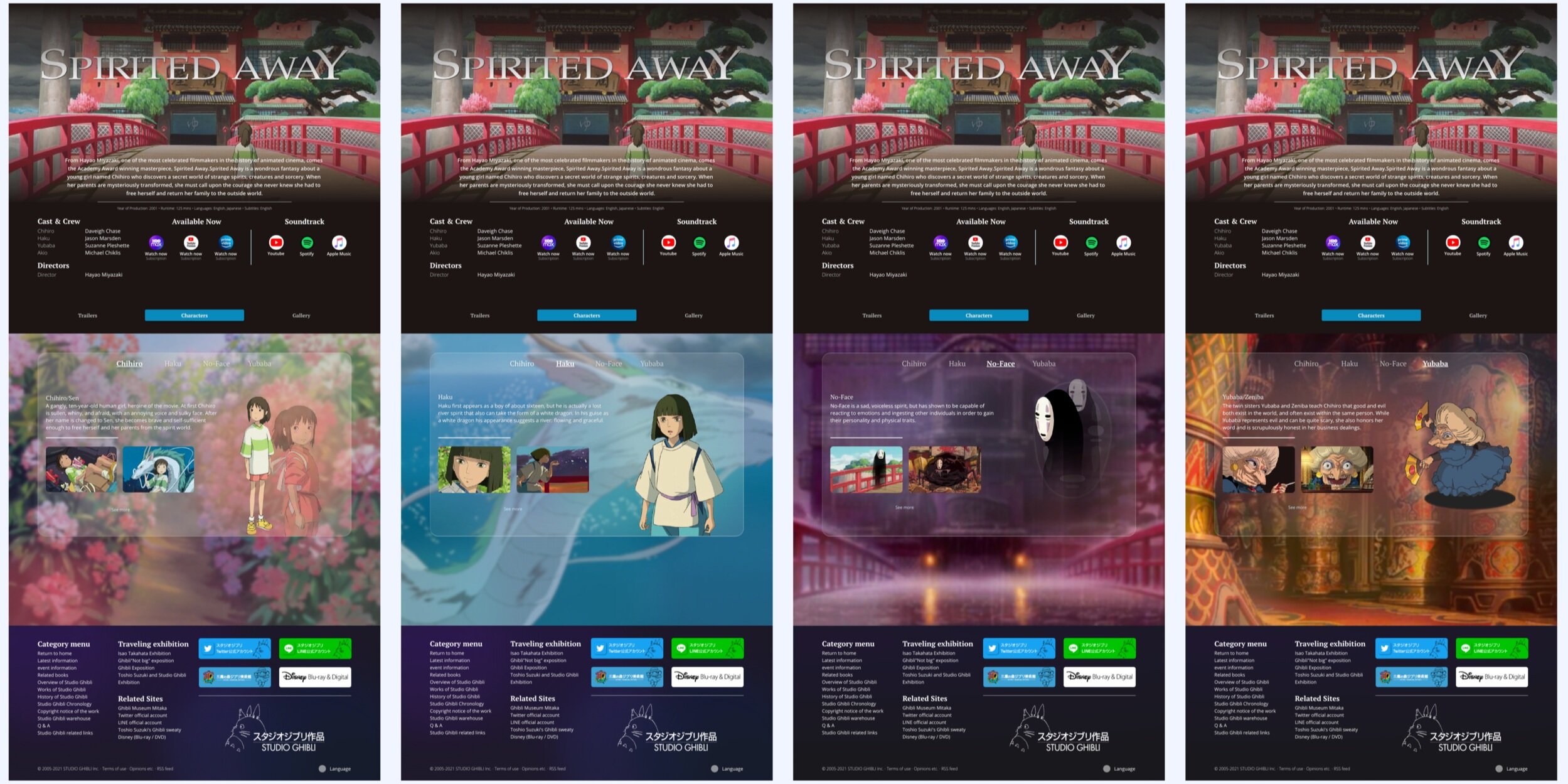
I chose to design the movie page for Spirited Away since it’s forever been my favorite Studio Ghibli film.
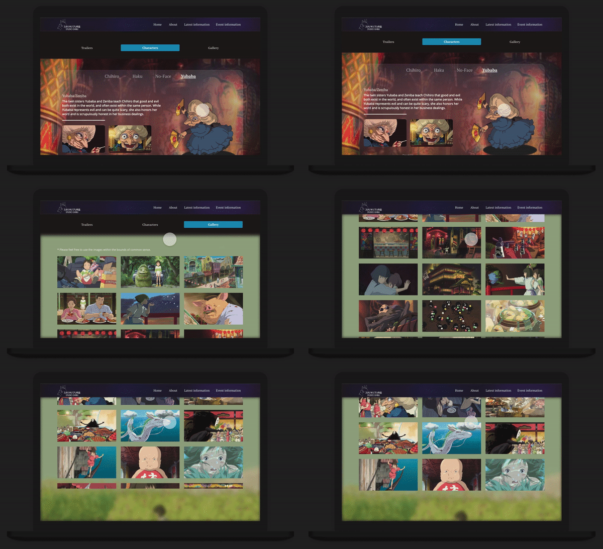
Aside from providing CTA links to streaming services where users can watch the movie, I wanted to provide an incentive for users to stay and interact more before being redirected. In order to do that I used a segmented control button to provide further areas of expansion for the movie; trailers, character cards, and an image gallery where users can download high quality screenshots of the movie.
Functional Prototype Demo
All frame and component interactions across all screen sizes
Reflecting on the process
Redesigning the official Studio Ghibli website as one of my capstone projects was a special experience I can hardly put into words. Designing in Framer was a blast because of the limitless potential in breathing life into a static website. As a huge fan of studio ghibli, it felt almost personal to ensure their website evokes the same beauty and passion as their films.
Using a new design program throughout the entirety of this capstone was difficult, and at times I nearly abandoned my efforts in Framer and returned to Figma. Nevertheless, I’m happy to have persevered through the steepest learning curve because the resulting mockups were beyond anything I could have designed in Figma.


